healthcare

What Automobile Technology Evolution has helped me realize about Health IT, UX, and Patient Safety

My source of inspiration

My source of inspiration

It is amazing (and sometimes scary) what can go through our minds during a solitary drive. While taking a solo road trip through beautiful southern Utah, I starting thinking about cars. I guess it makes sense seeing that I had been in one for hours as I was approaching Bryce Canyon National Park. I felt a lot of appreciation for some of the safety features that I did not have on my previous cars like the rearview camera, proximity sensors for merging, and bluetooth to safely handle incoming phone calls. I was in awe over how much the automobile has really evolved. 

There were already a variety of different steam and gasoline powered cars that had been invented before Henry Ford came along to introduce the fairly affordable Model T in 1908. Those initial Model T’s had no wheel brakes, optional windshield wipers, no radio, all while having a max speed of 45 mph. I’m guessing it was a heck of an upgrade from getting around on horses. 

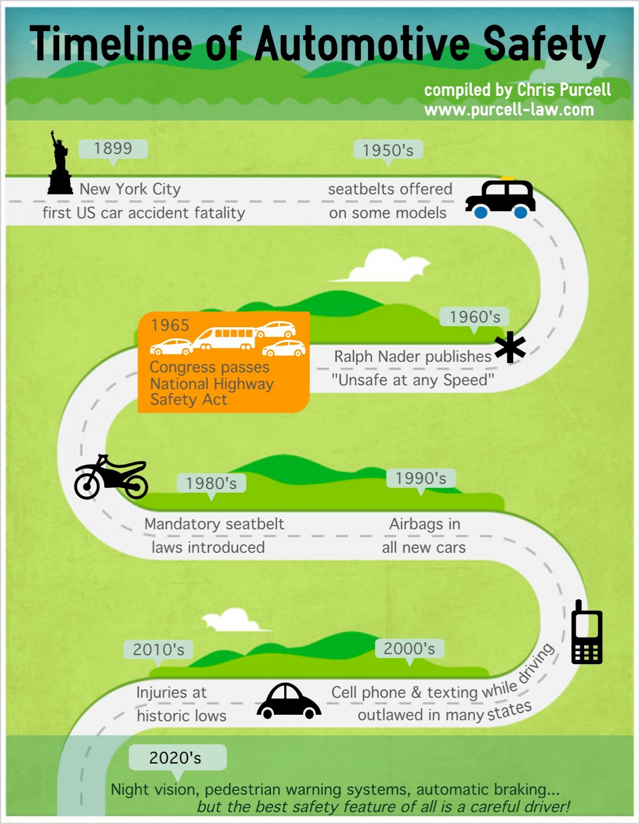
From a safety perspective, the evolution of the automobile was fairly slow: seat belts were not a standard feature in any car until Saab did it in 1958. Not that it mattered much since it took nearly another 30 years for them to be required by law in the United States. The progression has seemed to move faster since the first airbags were added in the 1990s. Now we have those cameras and proximity sensors. Human error may be removed completely in the near future since we may not have to even manually drive cars

That is not to say driving a car is still a perfectly safe endeavor. Accidents still happen. Console designs can still use a little work. One of my friends recently shared her story of a near accident while she was changing the internal temperature. Instead of a knob, the control was a button that required more of her attention which was not on that other car on the road. After over 100 years of evolution that has given us some amazing achievements, safe driving technology still has not been perfected. 

This mini-revelation got me thinking about healthcare IT, patient safety, and User Experience. On their own, each of these fields are still relatively new:

  • EMR giant, Epic, was founded in 1979. 
  • The first book on usability that I ever read was Jakob’s Nielsen’s “Usability Engineering”, which was first released in 1993. Don Norman’s “The Design of Everyday Things” was published 7 years earlier. 
  • The infamous "To Err is Human: Building a Safer Health System” report that launched numerous patient safety research initiatives just turned 15 last year. 
  • And the stimulus package that created the Meaningful Use initiative and boosted the Health IT world was passed in 2008. Which is around the same time I first heard the term “user experience”. 

I have been working in the unique crossroads of Health IT, Patient Safety, and UX for over 10 years. It has certainly been a chaotic ride. I have often wondered how many more stories from clinicians about the poor usability of their software that I can stomach to hear. How much longer can I continue to beat my head against the wall as I see designs cut down due to technical and business constraints. How much more finger pointing between clinicians, hospitals, and vendors will continue on as the patients have little say on the situation. 

The reality is: These are still young fields, and I have been living in their adolescent phases. Of course it is chaotic. Of course there are complaints about HIT usability. Of course the culture change that has to follow rapid technology advances feels like it is moving like a glacier. If 100 years of automobile evolution hasn’t made driving a perfectly safe endeavor, how is it possible we have made Health IT perfectly safe and usable in 20-30 years? 

Looking at the big picture, amazing steps have been taken in these last 10 years. I am so much more efficient at wireframe design and recording usability tasks because of the tools now available to me. There are companies with Chief Experience Officers. There are many new organizations that are focused on patient safety initiatives and health IT improvements. The occurrence of ICU blood stream infections has decreased. Good user-centered design practices are no longer a nice to have in healthcare, but have become a competitive necessity. If you like to follow the money - over $4 billion was invested in digital health start ups last year! And frankly, my Twitter feed is overwhelming most days when I look at the amount of information that is available to me in just seconds. 

I guess if I took anything away from my road trip, it’s that I need to not be so frustrated that the junction of health IT, UX, and patient safety are not in this ideal place where I want it to be. We have come a long way, but there is a lot more work to be done. All of us - clinicians, health systems, vendors, designers, developers, etc - have to work together to evolve our fields in the right direction. Just the fact that the AMA is asking the ONC to change EHR certification to focus on “usability, interoperability, and safety” shows me that we are indeed continuing to evolve. So let’s roll up our sleeves, stop pointing fingers, focus on the patients that need our help, and go build great healthcare products!

I am really excited to see where this evolution will bring us in ten years…

The Ebola Miss: A System Breakdown

Unless you have been living under a rock, you probably have noticed there has been some panic over the ebola virus making its way to the US recently. One of the major aspects of of the coverage has been around the case of Thomas Duncan, the patient who died from ebola after the ER initially missed the diagnosis. 

Naturally, there has been a lot of blame going around on how such a thing could be missed. What intrigued me was the initial statement from Texas Health Presbyterian Hospital Dallas blamed their EMR for the miss, and then the statement was retracted days later.  The follow up statement from EPIC saying there is “no flaw” in their system has caused strong reactions, ranging from scathing to defensive to general eye rolling within the Health IT community. 

It is no secret that there is a lot of dissatisfaction with EMRs and Health IT in general. I have already written about the AMA jumping in with their recommendations to improve EHR usability. To add to this, a new report is indicating that nurse satisfaction with EMRs has hit a new low. Through my many years as a UX designer in healthcare, I have personally heard all kinds of horror stories of poor EMR design. These problems make it is very easy to point the finger at the EMR vendors. The reality is, poorly designed health IT systems are just part of the problem. 

Healthcare is a system: it consists of various clinicians with various specialities, working together in high stress environments, using different tools and technology (including EMRs), with different rules, regulations, and reimbursement policies hanging over their heads. Oh yeah, and the most important piece at the center of all of this is the patient needing treatment. The University of Wisconsin SEIPS model provides an easy way to see the complexities of a healthcare system.

Let’s look at the Environment piece of the situation. The ER is an overwhelming place to work. A patient with a fever is not going to stand out in such a crazed environment where mistakes can easily be made. Add the cultural aspect where doctors are trained not to assume rare diseases and “look for zebras”. Let’s be fair - when have we ever discussed the issue of ebola in the US before this (and no, the movie “Outbreak” doesn’t count.) These factors were just part of the systemic error that caused the ebola miss. 

Vamsi Aribindi explains the systemic breakdown of the situation very well. He points out four (not one) errors that led to Mr. Duncan being sent back home when he should have been immediately admitted. A lying patient, missed communication, a crazed environment, and a key piece of information not on the physician screen of the EMR were all holes in the swiss cheese

What bothers me about the situation is that there continues to be a blame culture in healthcare after years of Patient Safety research have shown errors such as this are to system breakdowns. There is usually not “one throat to choke”. I realize that pointing blame is basic human nature, but the discussion should initially start at how can we avoid this from ever happening again. Once the appropriate investigations are done, the key lessons need to be shared for the entire healthcare system to benefit. 

It is important to remember EMRs are just a tool in the healthcare system meant to treat patients. Many have treated EMRs and technology in general as a “silver bullet”. Unfortunately, silver bullets rarely fix big systemic issues, especially when they have their own set of flaws. 


AMA Makes Usability Recommendations

It is no secret that the usability of many healthcare IT systems are subpar and causing a lot of users headaches and anxiety. This is especially true with EMR systems. For years, I have heard complaints first hand from nurses and pharmacists about how much extra work it takes to navigate these systems. It seems an even larger voice is speaking up about it: doctors. 

The American Medical Association (AMA) caught my attention recently when they released a framework for their top 8 usability priorities for EHR usability. This is coming not long after a RAND report showed increased physician dissatisfaction with EHRs, and a lot of talk about health organizations wanting to switch vendors

The 8 recommended ares of improvement listed are (view the full report here): 

  • Enhance physician's ability to provide high-quality patient care
  • Support team-based care
  •  Promote care coordination
  • Offer product modularity and configurability
  • Reduce cognitive workload
  • Promote data liquidity
  • Facilitate digital and mobile patient education
  • Expedite user input into product design and post-implementation feedback

Two things caught my attention when I read the report. The first was a strong call for better User Research from the vendors. In order to reduce cognitive workload and enhancethe ability to provide high-quality care, there needs to be a real understanding of the clinical workflows that need to be supported. The AMA specifically calls out bringing user input in the product design lifecycle - that is a recommendation for User Centered Design. UX Researchers everywhere rejoice! 

The other item that caught my attention was the item on product modularity and configurability. In other words, we need better interoperability between systems. This is a hot topic of discussion in the Health IT world right now. The reality is, not one piece of technology can do it all well. AMA President-elect Steven J. Stack, M.D states this nicely: 

 “Now is the time to recognize that requiring electronic health records to be all things to all people - regulators, payers, auditors and lawyers - diminishes the ability of the technology to perform the most critical function - helping physicians care for their patients,”

For a while it seemed usability was just checking a box or a competitive differentiator in healthcare. But there has been a push to improve health IT usability coming from the ONC and NIST standards. The AMA has a lot of influence, and now they have evidence to show this needs to be addressed. In my opinion, the AMA report is a signal that we have reached the point where good health IT usability is an expectation.

I’m glad to see this tipping point has been reached. What concerns me is how the industry is going to overcome years of technical debt to really provide usable, streamlined clinical solutions to all caregivers. It appears to be time for third party Health IT vendors to shine.

Building Empathy to Reduce Load Times

I don’t think anyone would debate with me that we live in an inpatient, instant gratification society. Technology has come such a long way that we get frustrated whenever something requires waiting. One of my favorite comedians, Louis CK, hilariously explains it: 

I will admit, a few extra seconds to wait for my fantasy football team to come up on my phone is really not the end of the world. But there is evidence that slow load times to access a site or application can lead to a poor experience. This slowness can cause someone to give up, leading to a lost sale on a retail site. In healthcare, this could mean less time a physician is focused on a patient during a visit or a pharmacist reviews fewer potential medication interventions during a day

Improving application performance and load times usually means tackling technical debt, which tends to be pushed backwards in product priority. So how does one go about showing the importance of fixing these issues? 

Make the product managers, developers, analysts, and testers really feel the pain to raise the level of empathy for the users. I have tried a little activity to help show the pain caused by slow load times. I call it the “Stop Watch Game”:

I presented a few colleagues a user scenario that involved running a search. I started simple: assume you are one of our users, and you need to create a list of patients on a specific medication in your facility. I instructed them to imagine they have pushed the Run/Load button when I say “go”. They wait and tell me when they would expect the result to load by saying “stop”. This was not done with the application up and running - just hypothetical. Using the stop watch on my phone, I timed the “go” and “stop” commands. My colleagues typically would let the simple queries only go between one and two seconds. I informed them of the reality by starting the stop watch, saying “go”, and then letting the clock run until the real average load time on our application came across. 

I could start to see the awareness by their impatience during that second round of this game. This exercise was even more powerful when I presented a search scenario involving a complex report where load times are naturally going to be longer. Once again, they expected quicker load times then the current reality. The Nielsen/Norman article states that at 10 seconds the user will get distracted and want to move onto other things. So naturally, I said “go” and made everyone sit there for 10 seconds. Talk about a fidgety group. I finally asked the group if they thought that maximum allowable load time was really good enough. 

I’ll admit a couple things: this really isn’t a very fun “game”, and there are other ways to build empathy for users in UX. Ideally, I would have everyone sit in on my usability studies and listen directly to the feedback from our users. Outside of how uncomfortable it would be to have 10 people watch you do your job, the reality is not everyone outside of UX has the time for observing that many studies. Sharing the results and videos from a study can also help, but I have found that is not as engaging as seeing it real time. 

I did the “Stop Watch Game” in a requirements meeting when acceptable load times for a feature became the topic of discussion. At the end of the meeting I had buy in from the team that they would include appropriate, yet realistic load times in the acceptance criteria and they would test to the metrics. I was able to sell the importance of taking on some technical debt in 10 minutes, without having to show videos of inpatient users. 

I like to call activities like this “empathy builders”. Building empathy with colleagues is such an important part of the User Experience process. I have found sharing the pain users have with not so usable software seems to resonate with colleagues more than metrics and usability requirements. 

If playing with a stop watch for 10 minutes is a way to build that empathy to improve the usability  of a product…then I’ll take it.

The Best Career Advice I Recieved

I was recently asked by a friend what was the best advice I have received in my healthcare career. My first thought was “wow, that’s a tough question!” As I was racking my brain, I could have come up with something cliche like “be passionate about what you do” or “be comfortable saying you don’t have the answer”. As I was cycling through my brain, I suddenly flashed back to an early point in my career:

“If you don’t spend time in their environment, how will you know how users really use your product?”

To give some context, I was very new to the world of User Interface design and was the lead Usability Engineer for a critical care ventilator. I was working with designs coming from the anesthesia device product line to promote consistency between the products and to ease the cost of development. The Product Manager shared his Respiratory Therapy experience by sharing the common ventilator settings that needed to be programed. Here is what the RTs do, here is what the other development team is doing, figure out where it goes on the display - no problem! 

But there was a problem: I had never set foot in an ICU. I heard a lot of stories, seen a few pictures, but I was designing off a lot of assumptions and from my knowledge of observing a few surgeries in the OR. Enter Terri, a former ICU nurse and great colleague and friend of mine that felt the need to not so gently guide me on the right path. I honestly can’t remember if those were her exact words, but the message rang clear. I was never going to make the best design decisions if I didn’t get a chance to observe the messy, real world environment of the ICU. It was an easier said than done solution, since most hospitals prefer that some random guy does not just walk into an ICU.  

My opportunity finally came through the unfortunate admission of my grandmother into the ICU. 50 plus years of smoking, high cholesterol, and COPD will usually require the need to be placed on a ventilator. It was an emotionally difficult time, filled with potential end of life care discussions. Since she was expectedly anxious, I decided to help the family out by spending a couple nights in the room with my grandmother. 

It ended up being a learning experience as I was immersed into the day to day life in the critical care environment. I was able to observe clinician interactions with my grandmother and the equipment in her room. Some things I noticed included:

  • Her ventilator was tucked into a corner, behind a lot of other equipment. I think I saw it touched once in 2 days. 
  • The nurses usually came in the room, checked my grandmother, checked her vitals, and looked at the IV pumps before leaving the room. They usually didn’t glance at the ventilator.  
  • If my grandmother coughed and trigged the high pressure alarm, no one came running in a panic…in fact usually no one came in. Alert fatigue is a real thing. 
  • A Respiratory Therapist would come in every few hours for a nebulizer treatment. They would check the ventilator, but hardly needed to adjust anything. 

Before this, I was designing under the assumption that the ventilator was under constant supervision, like an anesthesia machine. This was hardly the case. The ventilator was a life support tool that rarely needed to be adjusted compared to the IV pumps, catheters, and other equipment keeping my grandmother alive. You set it up, might make an occasional adjustment, and you just expected it to work. 

After that experience, I remember coming back to work and saying “I get it now, I really get it” to Terri. I understood the environment and each clinicians interactions within that environment. I saw how busy and overwhelmed the clinical staff was. I finally realized that what I was designing was a piece of a much bigger clinical puzzle to care for a patient. 

In the product development world, it is easy to have such a strong focus on the product that it is designed as if it is the most important part of someone’s day. The reality is, most of us are designing products that are just a tool…and may not be looked at for more than a few minutes over the course of the day. In healthcare, the patients really are the most important piece of that puzzle, not the technology. This is just one reason why User Research is so important in the development lifestyle. Good User Research shows the reality of the problems in a work environment allowing for smarter, more informed design solutions. 

I have had a few of these reality checks in my career (here’s another great exmaple). I would like to think these experiences have made me a much better UX designer as a result.

Just remember: “If you don’t spend time in their environment, how will you know how users really use your product?”